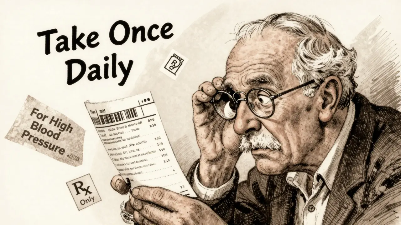
You pick up your prescription and stare at the label. Last time, the instructions were in bold at the top. Now they’re tucked in the middle, in smaller text. The name of your medicine is written out fully here, but last month it was abbreviated. The reason you’re taking it? Gone. You squint. Did they say once a day or twice? You call the pharmacy. You’re not alone.
Why Do Prescription Labels Look So Different?
No one set out to confuse you. But across the United States, there’s no single rulebook for what a prescription label should look like. That’s why your bottle from CVS might look nothing like the one from your local independent pharmacy-or even the same pharmacy last month. The truth? The federal government doesn’t require a standardized patient label. The FDA only insists on basic info: your name, the drug name, dosage, and the "Rx only" symbol. Everything else? That’s up for grabs.
The closest thing we have to a national standard is USP General Chapter <17>, published in 2012 by the United States Pharmacopeial Convention. It’s not a law. It’s a set of evidence-based guidelines built from decades of research on how people actually read and understand medication instructions. It says: use clear, sentence-case text (not all caps), pick a clean sans-serif font like Arial, leave enough space between lines, use high-contrast black ink on white paper, and most importantly-tell patients why they’re taking the medicine. Not "for hypertension." Say "for high blood pressure."
But here’s the catch: states decide whether to enforce it. As of 2023, only 28 states have adopted USP <17> in full. Texas requires a minimum 10-point font size. California demands bilingual labels for certain drugs. New York has its own spacing rules. So if you move, refill at a different chain, or even switch pharmacies within the same city, your label might change shape, layout, and wording-without you being told why.
What’s Actually Required vs. What’s Just Recommended
Let’s break it down. The FDA’s rules under 21 CFR § 201.56 are meant for doctors and pharmacists-not patients. They demand detailed scientific data about side effects, drug interactions, and dosing ranges. But none of that goes on the bottle you hold in your hand. What’s on your label? That’s mostly governed by state pharmacy boards.
Here’s what’s almost always required:
- Your full name
- The prescriber’s name
- The pharmacy’s name, address, and phone number
- The prescription number
- The date it was filled
- The drug name and strength
- Dosage instructions (how much, how often)
- The prescriber’s DEA number
That’s the legal minimum. But what’s missing? The reason you’re taking it. The warning to avoid alcohol. Whether to take it with food. Whether it’s safe to drive. These aren’t required by federal law. But USP <17> says they should be there-and research proves they help.
A 2021 study in the Journal of the American Pharmacists Association found pharmacies using USP-compliant labels saw a 27% drop in patient calls asking for clarification. That’s not just convenience-it’s safety.
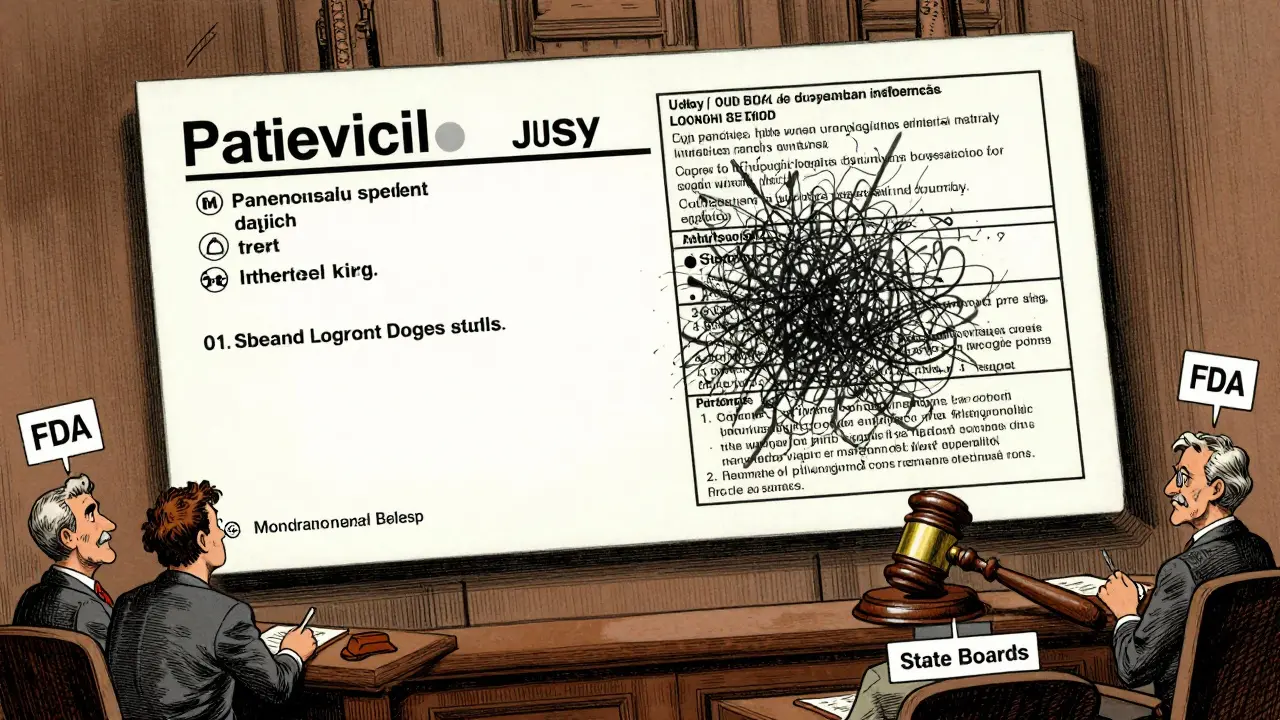
How Pharmacy Software Makes Labels Worse
Even if your pharmacy wants to follow USP <17>, they might not be able to. There are about a dozen major pharmacy management systems used across the country. Each one formats labels differently. One system might put the dosage instructions in a box. Another might stack them vertically. One prints the purpose of the drug in italics. Another doesn’t print it at all.
Pharmacy techs on forums like Pharmacy Tech Forum report that switching between systems-even within the same chain-causes label layouts to change randomly. One refill might have clear, bold instructions. The next might bury them under tiny, dense text. Patients notice. One Reddit user shared how they took double their blood thinner dose because the label format changed between refills. The word "twice daily" moved from the top to the bottom. They missed it.
That’s not a mistake you make once. That’s a mistake you make because the system didn’t help you avoid it.

Why This Isn’t Just an Inconvenience-It’s a Safety Risk
Medication errors kill over 250,000 Americans each year. That’s the third leading cause of death in the U.S. And a big chunk of those errors? They come from misunderstood labels.
The Institute for Safe Medication Practices says name confusion and unreadable labels are the #1 reason people take the wrong dose. A 2021 survey by the National Community Pharmacists Association found 68% of patients have trouble understanding their labels at least sometimes. Over 20% say they’ve made a mistake because of it.
In Texas alone, 417 medication errors between 2019 and 2022 were directly tied to label confusion. That’s not an outlier. It’s the pattern. And it’s preventable.
Dr. Michael Cohen, a leading patient safety expert, says if every label followed USP <17> standards, medication errors could drop by 30 to 40%. That’s tens of thousands of hospitalizations avoided every year. And it costs almost nothing to fix-just better design.
What’s Being Done to Fix It
Change is slow, but it’s happening. CVS Health announced in April 2023 that it would roll out USP <17> labels to all 10,000+ of its pharmacies by the end of 2024. Their pilot in 500 stores cut patient clarification calls by 33%. That’s not marketing. That’s proof.
The Biden administration’s 2022 Patient Safety Action Plan includes a goal: 90% of states adopting standardized labeling by 2026. The FDA has also issued draft guidance urging better label design-though they’re not yet mandating it. That’s a big step. But until it becomes law, we’re stuck with a patchwork system.
Meanwhile, the market is adapting. Companies building smart pill dispensers and medication apps now translate messy physical labels into clean, consistent digital versions. They’re doing the work the system should be doing for you.
What You Can Do Right Now
You can’t control the label format. But you can control how you use it.
- Always ask: "Why am I taking this?" Write it down. If they don’t tell you, ask again.
- Compare labels: When you refill, look at the new label side-by-side with the old one. Did the instructions change? Did the font shrink? Ask the pharmacist.
- Request accessibility: If you have trouble reading, ask for a large-print label, braille, or an audio version. Pharmacists are required to offer these under the Access Board’s guidelines-but only 12% offer braille, and just 5% offer audio. Don’t assume they’ll give it to you-ask.
- Use a pill organizer: If the label is confusing, use a simple weekly organizer. Fill it with help from your pharmacist. Don’t rely on the bottle alone.
- Take a photo: Snap a picture of the label when you get it. Compare it to the next refill. If it looks different, call the pharmacy before you take it.
Medication safety isn’t just about the drug. It’s about the label. And right now, that label is a gamble. But you don’t have to play.
What’s Next for Prescription Labels
The cost of medication errors in the U.S. is estimated at $29 billion a year. That’s more than what we spend on diabetes care. And 8 to 12% of those errors come from unclear labels. That’s not a small number. It’s a system failure.
As more pharmacies like CVS adopt USP <17>, pressure will grow on others to follow. Insurance companies and hospitals are starting to track label-related errors as part of quality scores. That means pharmacies will soon be penalized for bad labels-not just praised for good ones.
The future? Labels that look the same no matter where you get your medicine. Labels that speak in plain language. Labels that tell you why you’re taking the pill, not just how much. Labels that work for people with low vision, limited English, or trouble reading.
It’s not science fiction. It’s science. And it’s already working-wherever it’s been tried.


Write a comment